
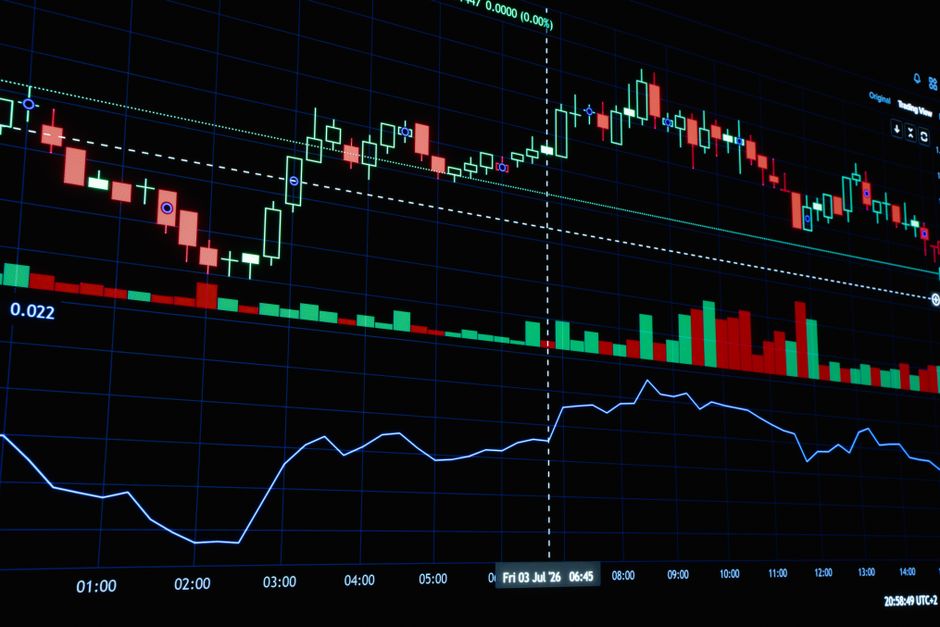
What Is a Line Chart in Forex? | ZenithFX
When you first open a forex trading platform, you are met with a canvas of price data stretching across your screen. Making sense of that data is one of the most important skills any trader can develop. Charts are the primary tool traders use to read price movements, spot trends, and make informed decisions. Among the different chart types available, the line chart is the simplest and most recognisable. Whether you are completely new to forex or brushing up on the basics, understanding what a line chart is and how it works gives you a solid foundation for everything that comes next.
The Basic Definition of a Line Chart
A line chart in forex is a type of price chart that displays a single continuous line connecting a series of closing prices over a chosen time period. Each data point on the line represents the closing price of a currency pair at the end of a specific interval, whether that interval is one minute, one hour, one day, or longer. The line is drawn by connecting these closing prices in sequence from left to right, showing how price has moved over time.
The closing price is used because it is widely considered the most meaningful price within any given period. It reflects where the market ultimately settled after all the buying and selling activity during that timeframe. By focusing exclusively on closing prices, the line chart strips away much of the noise that can make other chart types look cluttered or overwhelming for beginners.
Line charts are found on virtually every trading platform and charting tool available today. They are not unique to forex — you will see them used across stocks, commodities, and cryptocurrencies as well. However, in forex trading, they serve as an accessible entry point for understanding how currency pairs move in relation to time.
How a Line Chart Differs From Other Chart Types
Forex traders commonly use three main types of charts: the line chart, the bar chart, and the candlestick chart. Each one presents price data differently, and understanding the distinctions helps you choose the right tool for the right situation. The bar chart and the candlestick chart both display four key pieces of information for each time period — the open price, the high price, the low price, and the closing price. This gives traders a fuller picture of price activity within each interval.
The line chart, by contrast, shows only the closing price. This means you lose visibility of what happened between the opening and closing of each period. You cannot see how high or low price swung during that time. This is a trade-off. What you give up in detail, you gain in simplicity and visual clarity. A clean, uninterrupted line can make it much easier to see the overall direction of a market at a glance.
Candlestick charts are by far the most popular choice among experienced forex traders because of the rich information they provide. However, many traders still refer back to line charts when they want to step back and assess the broader trend without distraction. Both approaches have their place in a well-rounded trading toolkit.
What a Line Chart Can Tell You
Despite its simplicity, a line chart can reveal genuinely useful information about how a currency pair is behaving. The most obvious insight is trend direction. If the line is moving upward from left to right, the currency pair is in an uptrend, meaning the closing prices are generally rising over time. If the line slopes downward, the pair is in a downtrend. A relatively flat line suggests a ranging or sideways market where price is not making significant moves in either direction.
Line charts are also useful for identifying support and resistance levels. These are price zones where the market has historically reversed or paused. On a line chart, you can spot areas where the line has bounced upward multiple times from a similar price level, suggesting that buyers tend to step in around that zone. Similarly, areas where the line has repeatedly failed to break higher can indicate resistance. While candlestick charts often show these levels with greater precision, line charts still make the key zones visible.
Another thing a line chart helps with is seeing major swing points — the clear peaks and troughs that form as price moves up and down over time. Analysing these peaks and troughs helps traders understand market structure, which is a core concept in technical analysis. A series of higher highs and higher lows confirms an uptrend, while lower highs and lower lows confirm a downtrend.
The Advantages and Limitations of Line Charts
The biggest advantage of a line chart is its clarity. Because it filters out everything except closing prices, it presents a clean and easy-to-read picture of price movement. For someone just starting out in forex trading, this simplicity removes visual overwhelm and helps you focus on the big picture. Line charts are also excellent for viewing longer timeframes, such as weekly or monthly charts, where seeing the broad trend is more important than the fine details of individual sessions.
However, line charts do come with real limitations. The most significant is the loss of intra-period data. Because you only see where price closed and not where it opened, peaked, or bottomed during that period, you miss important context. For example, a period might close near where it opened, but price could have swung dramatically in both directions along the way. A line chart would show almost no movement, while a candlestick chart would reveal the volatility clearly.
For active traders looking to time entries and exits with precision, the line chart alone is rarely sufficient. Most experienced traders use it as a complementary tool alongside bar or candlestick charts, rather than as their primary analysis method. Understanding these limitations helps you use line charts appropriately rather than relying on them too heavily.
When Traders Use Line Charts
Line charts are particularly useful during the early stages of market analysis, when a trader is simply trying to understand the current direction and overall context of a currency pair before diving into deeper analysis. Many traders will start by viewing a line chart on a higher timeframe — such as the weekly or monthly chart — to get a clear sense of the dominant trend. From there, they might switch to a candlestick chart on a lower timeframe to look for specific entry points.
They are also commonly used in reports, presentations, and educational materials because of their visual simplicity. When you need to communicate how a currency pair has performed over a given period without overwhelming your audience with technical detail, a line chart does the job effectively.
- Trend identification: Quickly spot whether a market is rising, falling, or moving sideways.
- Support and resistance: Identify key price levels where the market has reacted in the past.
- Big-picture context: Step back from the detail to assess the broader market environment.
- Educational purposes: Learn the fundamentals of chart reading before moving to more complex chart types.
Getting Comfortable With Chart Reading
Learning to read charts is a skill that develops with practice and time. Starting with a line chart is a smart approach because it builds your ability to recognise trends and key levels without the added complexity of reading candlestick patterns or bar formations. Once you feel comfortable interpreting a line chart, moving on to candlestick charts becomes a natural and manageable progression.
It is important to remember that no chart type, on its own, guarantees profitable trading decisions. Charts are tools for analysis, and they work best when combined with a sound understanding of risk management, market fundamentals, and a consistent trading plan. The goal is not to find a magic chart that predicts the market, but to develop a clear and disciplined way of reading price information over time.
Practising on a wide variety of currency pairs and timeframes will help you build pattern recognition and confidence. The more time you spend studying charts in a risk-free environment, the better prepared you will be when real money is on the line.
Start Practising With a Free Demo Account
Understanding line charts is just the beginning of your forex education journey. The real learning happens when you apply these concepts directly on a live chart. ZenithFX.com offers a free demo account that lets you explore real market data, practise reading charts across multiple currency pairs, and test your analysis without risking any of your own capital. A demo account is one of the best investments of time you can make as a developing trader.
Open your free demo account at ZenithFX.com today and start getting comfortable with line charts, candlestick charts, and everything else the platform has to offer. Building your skills now, in a safe and supportive environment, puts you in a much stronger position when you are ready to take the next step in your trading journey.
🎓 Free Forex Education at ZenithFX
Access our full learning center — forex basics, advanced strategies, video tutorials, and live webinars. All completely free.
Leave a comment